Where were we?
In Zürich Kunsthaus, where the Robert Delaunay exhibition was attracting quite a crowd. I certainly was not going to have this gallery to myself, more’s the pity.
I realised that I knew little of his work, but the timeframe interested me and I was keen to learn more about these colourful paintings and their background.
The story began during the early 1900s when Delaunay and his friends began experimenting with painting portraits of each other. “The picture of a dapper young Jean Metzinger depicted here spectacularly captures the heady period of daring artistic experimentation upon which these two friends had now embarked” - or so it said on the label. Several portraits from this time were shown, followed by a series of paintings created in St Severin, Delaunay’s local church. These paintings were exhibited in a dark blue room, not exactly conducive to photographs and given the number of people in the exhibition as well, I decided to merely scribble notes at this point.
The dark room opened up into a brighter, more open gallery where a few more colourful paintings were hung. This piece, “The Tower addressing the Universe” was one of a series of works taking the Eiffel Tower as a central motif fragmenting into the landscape surrounding it. Knowing nothing of his work, I particularly appreciated the clear notes alongside each section, explaining his artistic development alongside the timeframe of world events.
With the benefit of such notes, it was clear to see how one led from another; how the Eiffel Tower became abstracted as shape and colour were explored and cubist principles applied.
The group of paintings known as The Cardiff Team Series followed, though I did not record the reason for that name at the time. Can’t imagine why I didn’t work it out! So now we have colour blocks, the Eiffel Tower motif and circular form to work on with the suggestion of a plane in the sky too.
Next came “the First Disc” series of circular forms with experimentation using colour combinations. No more cubism. It was time for another -ism. How about Orphism?
I was beginning to feel Robert Delaunay was a man after my own heart, flitting from one style to another. Oh that I had his artistic ability however! His vision took him back to the eternal Eiffel Tower works in the 1920s, creating more monumental effects with interesting perspectives. His work was firmly set in Paris and paid homage to the triumph of technology and progress (or so I noted in my sketchbook!)
I particularly liked how many of his favourite motifs recurred in several guises. Yes, the Eiffel Tower was a frequent feature of his work, but other motifs such as the aeroplane, the circular forms and Parisian landmarks such as the Arc de Triomphe are brought into compositions around this time.
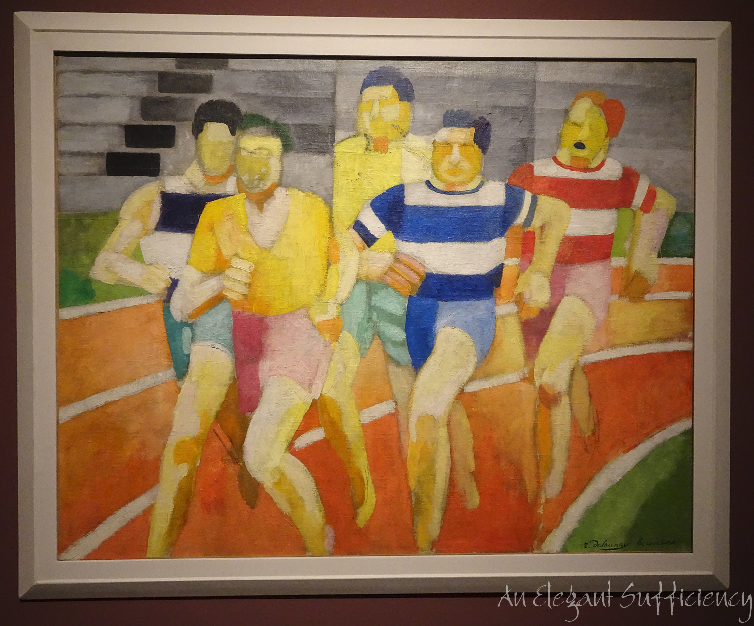
Following on from a room of portraits, which I didn’t find so interesting, I was pleased to come across the series of paintings I’d seen in the publicity material for the show. But most interesting was the background information to this work. Who knew?
Distinctly Delaunay, those blocks of colour are so effective aren’t they? And actually, when I thought about it, I’d seen something similar earlier in the day, in this painting. But another version of the runners alongside this first one proved interesting.
Hmm. That face! Better left out, don’t you agree? I much prefer the stylised version, without the distraction of the moustache, in particular.
Coming to the end of the exhibition now and entering the last couple of rooms, where a lively collection of rhythmic images were on show under the title “Return to Abstraction”.
This final image, entitled “Air Iron Water” was a study for a mural and seemed to sum up the whole show, for there they all were: the Eiffel Tower, the rhythmic discs, the engineering achievements, the Three Graces (which had been a study for a cubist-inspired work which I didn’t photograph) and somewhere in there, I believe there’s a small plane too. All in bright, glorious colour.
I’d known nothing of Delaunay’s work until today but had so enjoyed learning about it and yes, appreciating how it grew and developed over time. I think I might even claim to have a little understanding of it too.
What a great way to spend the day.


